From moody olive and orchid hues to Pantone’s dreamy Cloud Dancer, dubbed the colour of 2026, this year’s most popular wedding colour palettes deliver an abundance of ideas for every wedding style.
Whether your wedding style leans minimalist and modern or toward a more romantic, playful tone, you’ve undoubtedly thought about various ways to bring colour into the fold. Whether it’s simple, muted tones that are heavy on the classic white and neutral tones, or a splashy rainbow of colours, your wedding colour palette choice will trickle across every detail of your wedding.
In our recent survey of over 4,000 couples, which covers things like how much a wedding costs, we found that most couples planning a wedding in 2026 are opting for a predominantly white and neutral wedding colour palette with splashes of green, pink, or blue as accent colours.
That said, some of the more creative wedding trends give room for going bold with green, blue, and red lighting up couples’ mood boards as hero colours. We’ve also seen metallics, yellows, and black/charcoals continue to play bold accent colours.
Here are some ideas to consider if you’re in the process of choosing your wedding colour palette.
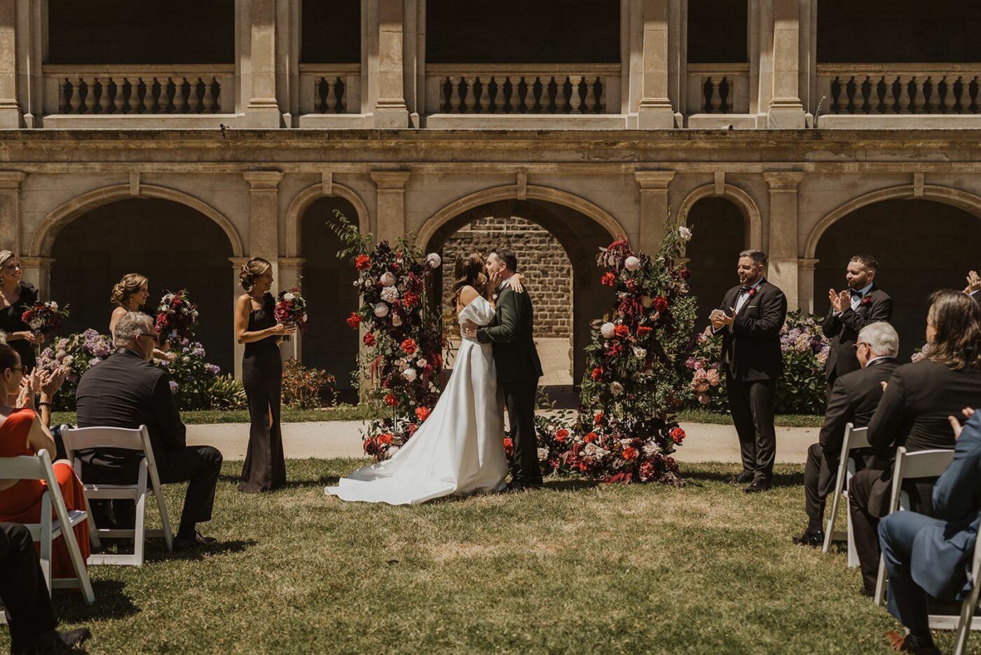
Cobalt Blue, Burgundy, Royal Purple
Bold, dramatic hues are reclaiming their place in high-end weddings, with deep cobalt blues, burgundy, and royal purple emerging as statement colours for 2026. These tones draw inspiration from high fashion, fine art, and eveningwear, bringing a sense of confidence and theatricality to wedding design. Used intentionally, they add richness and emotional impact without overwhelming the overall aesthetic.
In practice, these hues are often grounded with refined neutrals such as ivory, stone, or charcoal, or softened through luxe materials like velvet, satin, and glass. Couples are embracing these colours for formal settings, candlelit receptions, and editorial-style celebrations where mood is paramount. The palette speaks to a new kind of romance that is bold, expressive, and unapologetically personal, perfect for couples who want their wedding to feel like an immersive experience rather than a traditional template.
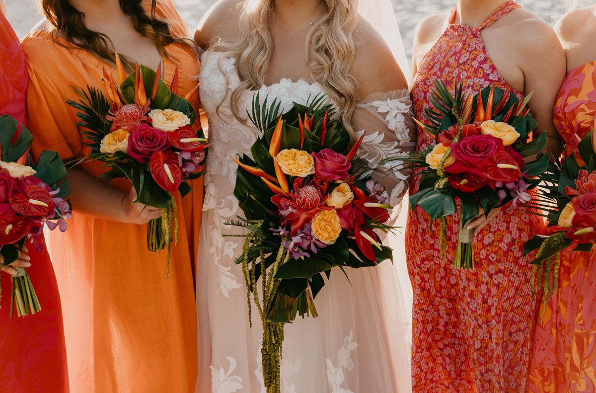
Island Citrus, Fresh Lime
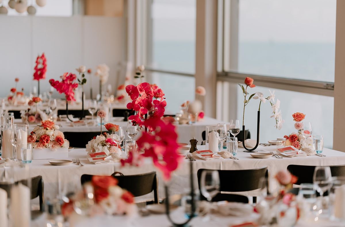
Vibrant and fresh palettes bring optimism and playfulness to 2026 weddings, with Island Citrus and fresh lime leading the charge. These energetic hues reflect a growing desire for joy, individuality, and colour confidence, particularly among couples moving away from conventional blushes and pastels. Bright yet sophisticated, these tones feel modern when balanced with clean whites, natural textures, or sleek contemporary styling.
Rather than being used everywhere, these colours often appear as strategic accents such as statement florals, stationery, glassware, or fashion moments, creating visual excitement without overpowering the design. This palette thrives in outdoor, destination, and summer celebrations where natural light enhances its vibrancy. It represents a shift toward weddings that feel expressive and alive, capturing a sense of fun while still aligning with high-end aesthetics.
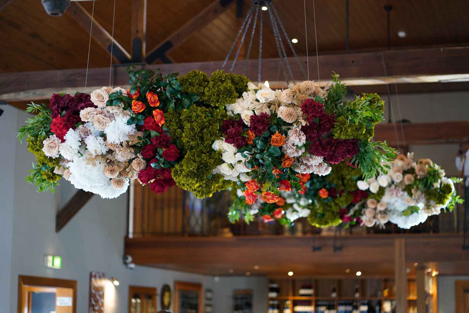
Olive, Terracotta, Buttercream
Earthy and natural hues continue to evolve in 2026, moving beyond rustic interpretations into a more refined, design-led space. Olive greens, terracotta, and buttercream neutrals evoke warmth, grounding, and connection to place, aligning with the ongoing emphasis on sustainability and authenticity. These colours feel especially relevant as couples seek weddings that are emotionally resonant and thoughtfully curated.
In luxury settings, these tones are elevated through intentional styling such as custom ceramics, organic floral installations, layered textiles, and natural stone elements. The palette adapts beautifully across seasons, offering freshness in spring and summer and richness in autumn celebrations. Earthy hues convey a sense of ease and intimacy while still feeling polished, making them ideal for couples who want their wedding to feel both elevated and deeply personal.
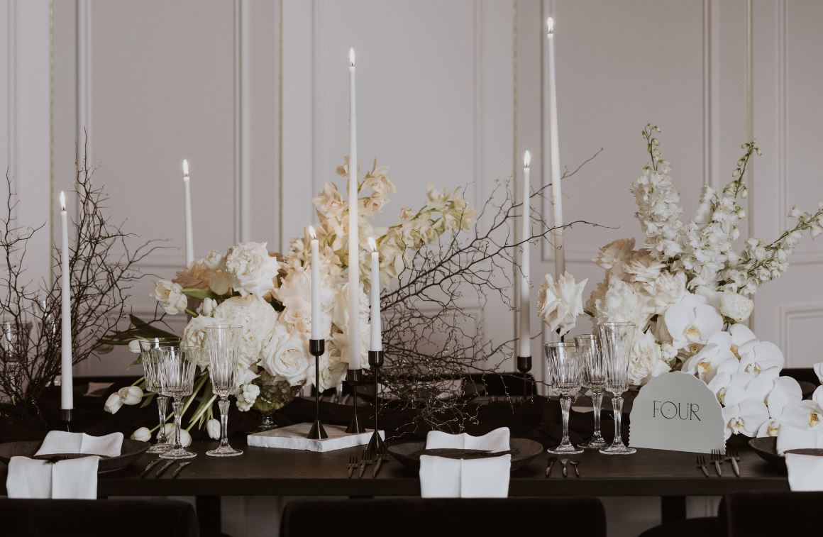
Pantone Cloud Dancer, Ivory, Cream
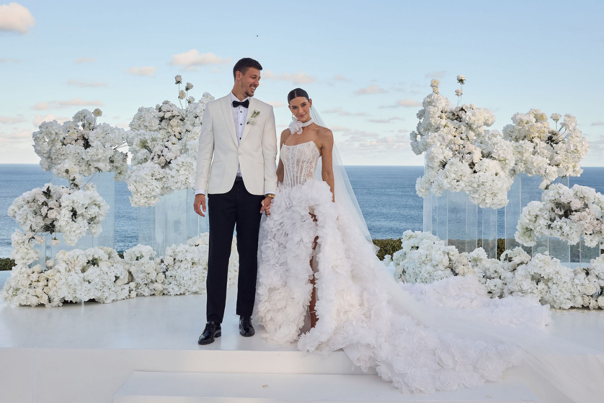
Classic and serene palettes are defining luxury weddings in 2026, led by soft neutrals such as Pantone’s Cloud Dancer, warm ivory, and creamy whites. These hues reflect a broader cultural shift toward calm, restraint, and intentional design. Rather than feeling stark or traditional, these tones are being layered with texture such as silk linens, stone ceramics, matte paper stocks, and sculptural florals to create depth and visual interest. The result is an elevated minimalism that feels timeless yet distinctly modern.
In weddings, this palette is often used as a foundation rather than a full statement, allowing form, craftsmanship, and detail to take centre stage. Designers are pairing serene neutrals with subtle metallics, soft candlelight, or tonal florals to create a warm and intimate ambience. The appeal lies in its versatility, as it translates seamlessly across venues, seasons, and cultural styles, making it a go-to choice for couples seeking understated elegance and enduring sophistication.
Pastels: Peach, Blush, Mint
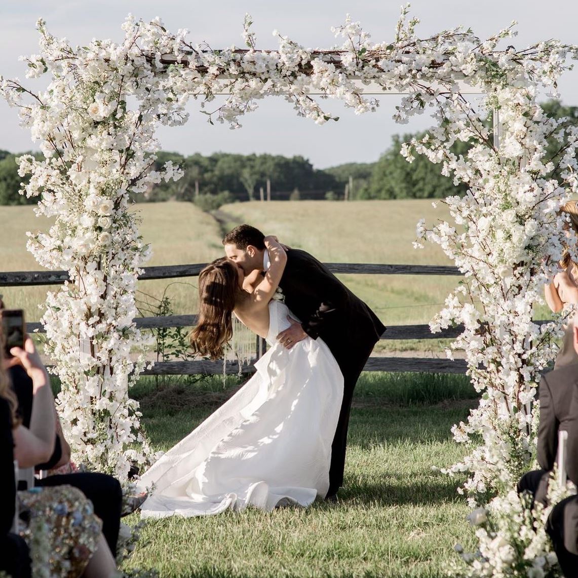
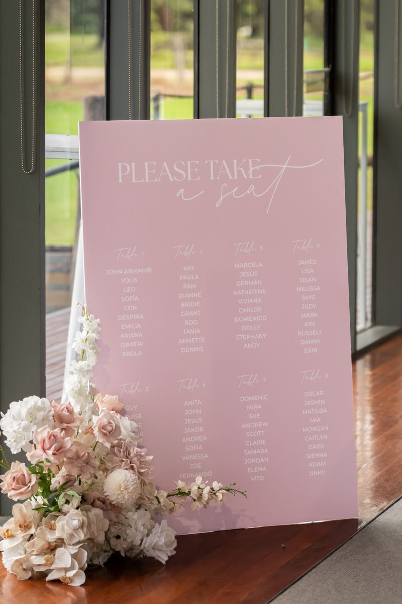
Soft and romantic palettes remain a staple for 2026, though they are being reimagined with a more contemporary lens. Peach, blush, and mint are less sugary and more nuanced, often appearing in muted, dusty, or slightly warmed tones. This evolution keeps the palette feeling fresh and editorial rather than traditional, appealing to couples who love romance but want it styled with intention.
These hues work beautifully when layered tonally or paired with refined neutrals and subtle contrasts such as warm grey or champagne. Designers are leaning into fluid fabrics, airy florals, and gentle colour transitions to create a sense of softness and movement. The result is a palette that feels emotional, intimate, and timeless, perfect for couples drawn to romance, storytelling, and understated beauty.
How to bring your colour palette into your wedding decor
From your invitation designs to your reception centrepieces, the colour palette you choose can easily integrate throughout your wedding day and all the communication leading up to it. Think about incorporating your colour choices into:
-
Your own dress/suit
-
Attire for the bridesmaids/groomsmen/anyone walking down the aisle
-
Save the dates
-
Invitations
-
Floral installations
-
Personal flowers
-
Floral centrepieces and vases
-
Guest book
-
Tableware, glassware, chargers
-
Table linens, napkins, runners
-
Table numbers
-
Seating chart
-
Drapery
-
Tenting
-
Flooring (think custom-painted dancefloor or throw rugs in lounge zones)
-
Lighting
-
Cake
-
Ceremony decor
-
Parasols on a sunny day
-
Creative backdrops
-
Hire furniture and throw pillows
-
Cocktails
-
Cocktail napkins
-
Taper candles
-
Hanging chandeliers
-
Signage, menus, place cards
 Our top three wedding planners to watch in 2026
  8 things to include in a garden wedding
  Say my name: 10 quirky wedding name card trends