 12 wedding invitation ideas we’re loving for the modern couple
By Content Team · November 21, 2025
But wedding fonts also set the vibe. It’s the first nod to your wedding guests when they receive their invite in the mail. It’s the first time your new name (if you’re changing it, that is!) will be written (besides doodling it on your notepad!) for all to see.
Choosing your wedding fonts isn’t just about looks; it’s the style of the wedding and of you two as a couple. Whether you’re designing your invitations, signage, menus, or wedding website, your fonts are one of the first things your guests will notice. And with Canva’s huge collection of stylish fonts, it’s easier than ever to match your type to your theme.
From classic serif fonts to whimsical scripts, here’s your ultimate guide to the best wedding fonts on Canva. And we’ve done the due diligence and organised it by vibe.
Follow us on Instagram, we have inspiration, style and also some memes to get you through your planning.
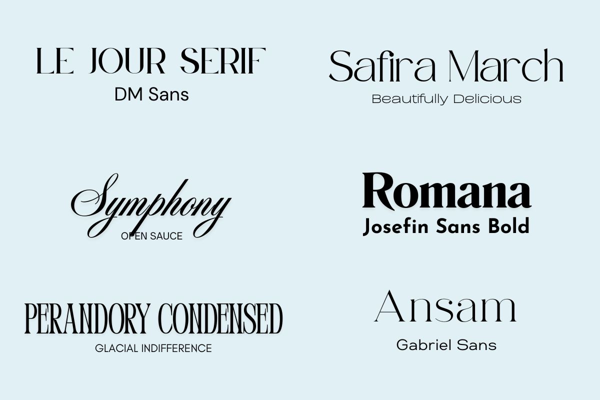
Canva wedding fonts to help you set the vibe for your wedding.
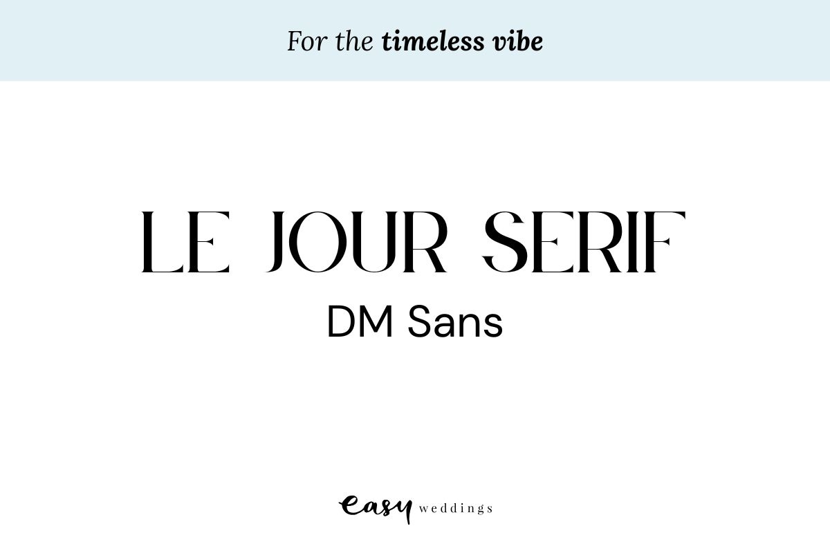
Are you thinking about holding a black tie soiree? If your wedding is in a cathedral or a heritage style building and your guests will be wearing their finest tuxedos and floor-length gowns you’ll be after something refined, stylish, always appropriate.
Pair Le Jour Serif or DM Sans with neutral, black and white, or metallic tones. It suits formal and traditional invitation wording and beautiful paper textures for a classic look. These pieces of collateral will never go out of style.
Starting your invites? Peruse our suppliers!
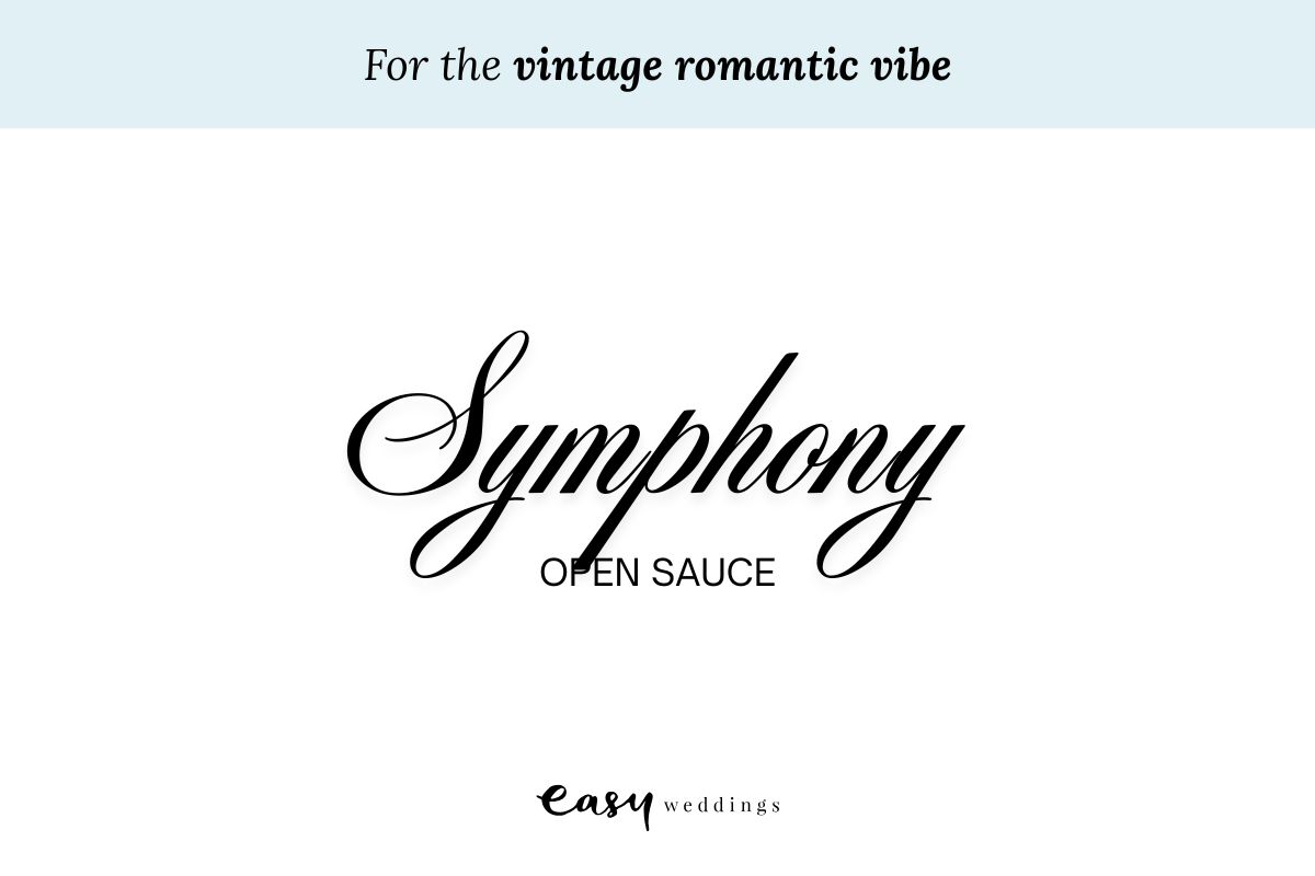
Have your guests asking, “Was this invitation written with a quill?” For couples drawn to nostalgia and romance, these antique fonts are a nod to a bygone era. For those who love velvet details and pressed florals, this has a rather theatrical edge.
We recommend Symphony and Open Sauce. Symphony for all the headings and Open Sauce as it can be a little gentler on the eyes for anything longform. These will be perfectly complemented by soft flora,s gold foil, and romantic wording… It’s a storybook for lovers.
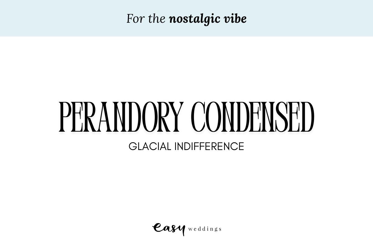
If you and your partner are a little quirky and going for a nostalgic and vintage vibe at your wedding, you might want to include Perandory Condescend and Glacial Indifference to your wedding fonts list.
Ideal for weddings that will include some disco balls, Polaroids, and a vintage cocktail menu, these bookish and simple fonts are perfect with warm colour palettes, checkerboard accents, and a few throwback pics to complete the look.
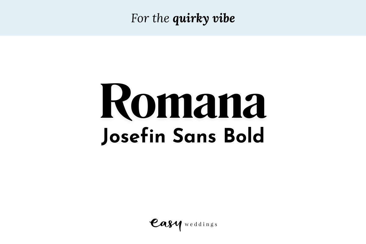
Your wedding fonts don’t have to be traditional, they can be full of life and fun. If your wedding is bucking some of the traditions and you’re rewriting the rule book, then Romana and Josefin Sans Bold should be on your shortlist.
These fonts are more chill, perfect for backyard weddings, coastal celebrations, or micro weddings. When we see them, we picture punchy colours, bold patterns, or something a little left of centre, like a zine or postcard invite. Break the rules, come on, you know you want to!
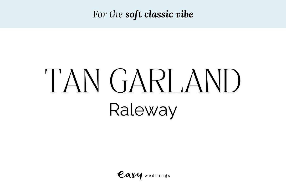
Floaty and romantic your vibe? If you’re picturing a little bit of fairy tale in a beautiful garden ceremony, with fairy lights, or you’ve chosen to ditch the shoes and celebrate the night bare foot, then Tan Garland and Raleway might be fonts you lean towards.
These fonts pair beautifully with water colour designs, botanical illustrations, and soft pastel palettes. Use them when you want your stationery to feel like it belongs in a Jane Austen novel, or a modern-day fairytale.
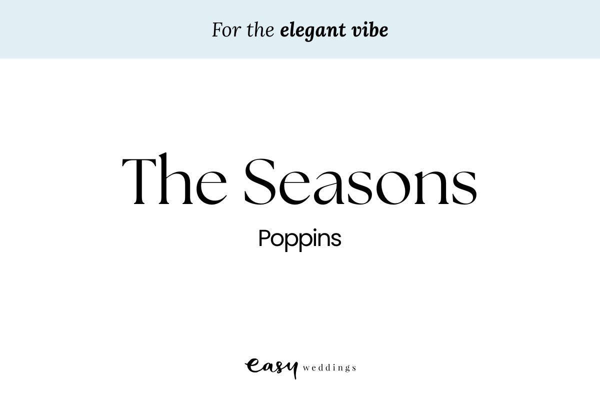
Having a wedding in a 5-star hotel? Or perhaps wanting to put negronis and espresso martinis on the menu. This sort of sophisticated soiree deserves some fonts to set the mood. The Seasons and Poppins are elegant but not exactly old-fashioned. The pairing of these fonts give ballroom receptions and black-tie dress codes. It feels graceful and grounded, like an Audrey Hepburn-themed event.
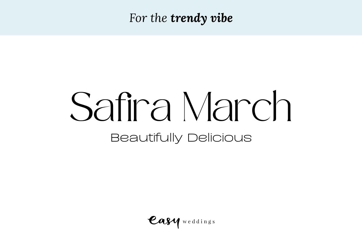
Have you been trawling through Pinterest and magazines, following the Chloe Sevigny and Lilly Allens of the world, taking notes of their ultra-cool weddings? Well, you might want to look at Safira March and Beautifully Delicious as your wedding fonts. Think oversized floral installations, curated cocktail menus, and a celebration that looks straight out of Vogue Weddings. This duo is perfect for editorial-style couples who want to turn heads from the moment the invite lands.
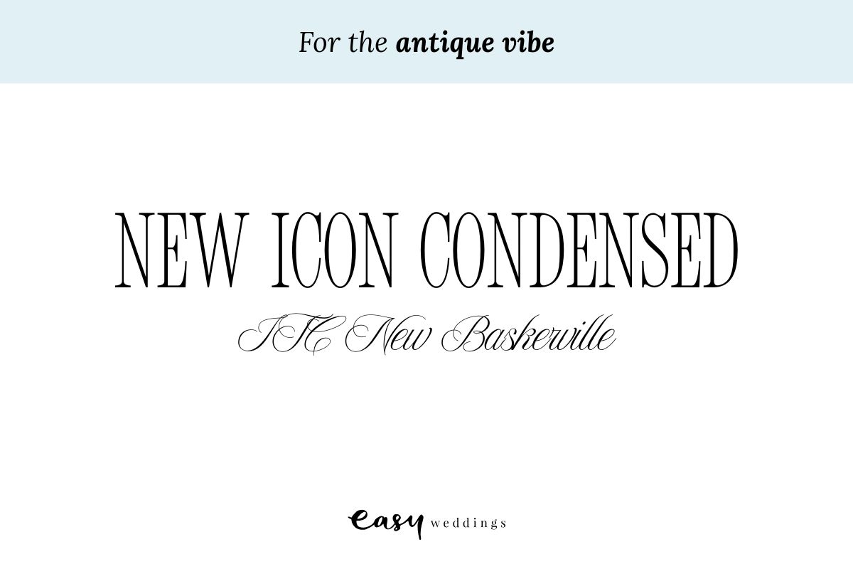
For those drawn to timeless storytelling and heirloom elegance, an antique aesthetic is all about fonts that whisper history. New Icon Condensed paired with ITC New Baskerville creates a sense of quiet romance and tradition, perfect for weddings in historic estates, old libraries, or countryside manors. Add textured paper, gold wax seals, or vintage stamps to complete the look.
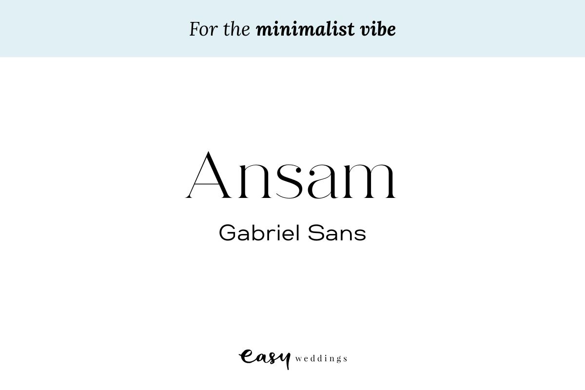
Minimalism doesn’t mean boring. Not at all. It means intentional. With clean lines, ample white space, and a no-fuss design ethos, a minimalist font pairing like Ansam and Gabriel Sans offers clarity and calm.
This combo is perfect for city weddings, micro celebrations, or couples who just want to let the beauty of simplicity speak for itself. Stick to black and white or earthy tones, and your fonts will do all the talking, quietly and confidently.
Planning your wedding has many moving parts, but you want your font and invites to really excite your guests. That’s why it seems like a small task, but you want to take your time and choose wisely, set the vibe and the tone!
Planning your wedding? Register for Easy Weddings, it’s free and will simplify the process for you.
Categories: Wedding Invitations
Tags: fonts, wedding invitations, wedding invites, wedding stationery, wedding style
12 wedding invitation ideas we’re loving for the modern couple
 A complete guide to wedding invitation wording
 What to include in your wedding invitations